All right, I admit it is perhaps a slight exaggeration but hopefully it caught your attention. Let me explain… and there will be a poll at the end.
My recent post Monochrome Enchantment was inspired by a superb exhibition at the Andrew Smith Gallery in Santa Fe of the works of Ansel Adams. Landscape photography never looked more breathtaking and I came away in awe of the drama and beauty of Ansel Adams’s black and white view of the world and a greater understanding as to why he is considered one of the greatest photographers of the twentieth century.
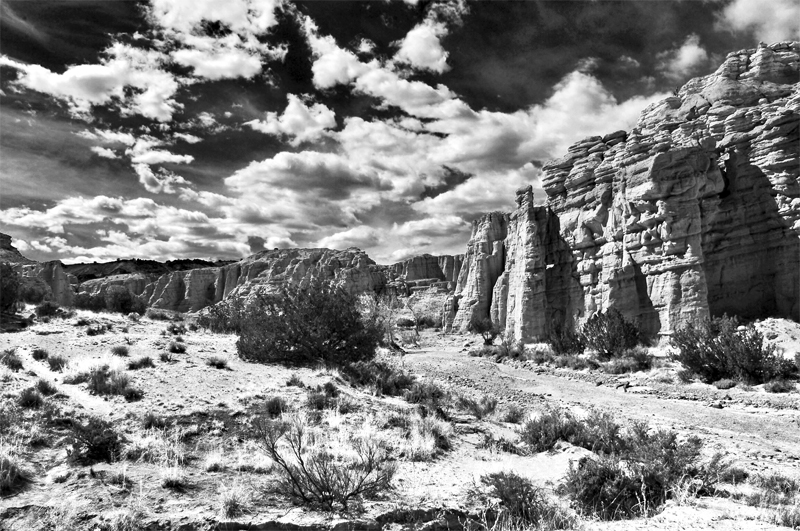
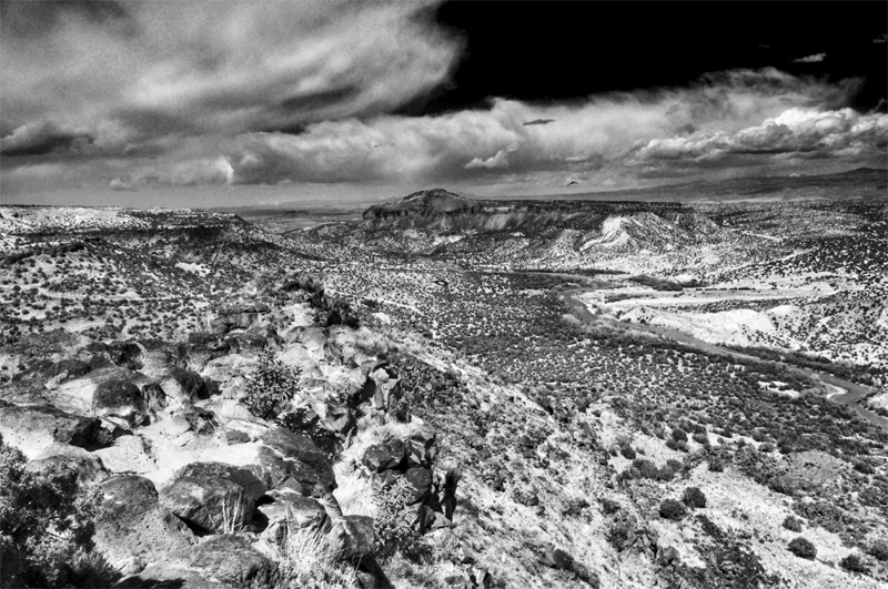
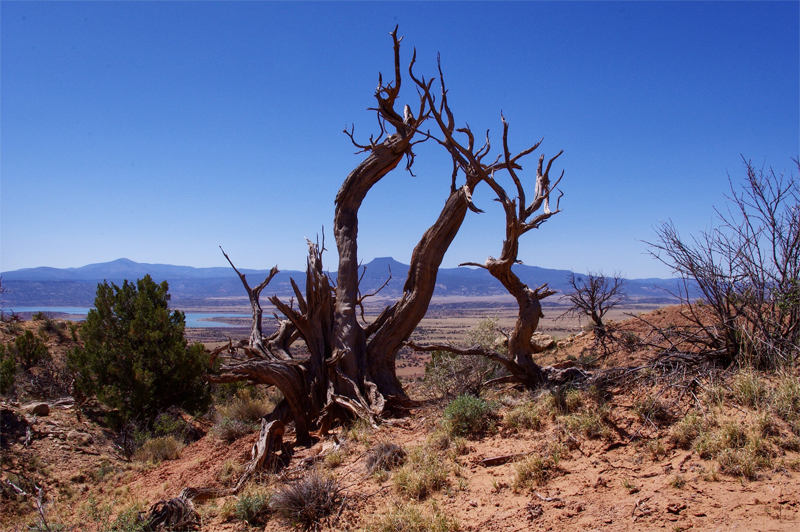
In creating my New Mexican monochrome landscapes, converting the color photographs from our recent visit to black and white, I entered the world of Ansel Adams and experienced the landscape, which I had captured with my trusty Pentax Kr, in a whole new light.

Years ago when I began photography I would develop my own black and white 35 mm negatives, like this one of St Paul’s, and feel that sense of wonder and excitement as each image began to appear in the tray of developer under the red light of my dark room.
How times have changed! Now, using Photoshop Elements on my MacBook Pro or Snapseed on my iPad, I can produce an equally as dramatic monochrome image that I like to think has just as much impact and, dare I say it beauty, in just a fraction of a second. What would Ansel Adams have made of this remarkable technology I wonder?
And so to the “Poll of the Century” (tongue firmly in cheek) and this week’s Photo Challenge: Twist. I invite you to take a look at my color photos of New Mexico and then imagine twisting the images to reveal their black and white counterparts. If I had a program that was able to do this I would have added it, but isn’t blogging all about using our imagination, so I know I can trust you to create the illusion. The poll follows and I look forward to seeing the results; your comments are always welcome.


My thanks and best wishes…Andrew

Always a hard decision to make between the two, especially when it comes to landscapes. Monochrome is more dramatic, but I think colour captures the feeling of being there better. Would have been interesting to see some of Adams’s photographs in colour!
LikeLike
Thanks for your great comment Doug. Interestingly the monochrome is winning out at the moment 🙂
LikeLike
Trending more to monochrome myself at the moment. Still a hard choice at times, deciding which one to post is another challenge!.Will be interesting to see the poll results.
Cheers
LikeLike
The results will be interesting. Thanks Doug.
LikeLike
I loved the poll! and thanks for sharing your story with this – very fun to read! also – you take some GREAT photos 🙂
LikeLike
Thanks Yvette. My best wishes on your Memorial Day 🙂
LikeLike
Ansel Adams was one of the first photographers I studied when starting out.
His work is inspiring!! Bet the exhibition was amazing.
I really do think the monochrome suits these images wonderfully.. such beautiful landscape images Andrew.. and I do agree it’s great to see the colour versions.
For me though, I think I explore the images more thoroughly when in B&W. It makes me wonder and ponder.
Great post!
LikeLike
Thanks for taking the time to write such great comments Robyn; very much appreciated. The exhibition was truly inspiring. Interesting to see that “Monochrome” is well in the lead in the poll. Best wishes 🙂
LikeLike
Hey, Andrew, brilliant to run a poll! And interesting that monochrome is winning out. I do like seeing the color versions alongside the b&w, but I, too, am leaning towards the monochrome (though I think in the fourth photo, the contrast isn’t as great in the foreground so it’s more difficult to discern the details – I like the color version of this one better). All great images, but my favorite is the last, and definitely in monochrome! All well done. Now I have to go register my vote 🙂
LikeLike
Thanks for your great comments Stacy and thanks for voting. I agree that it is interesting “Monochrome” is so far ahead of “Colour”. It certainly validates having a poll and also of taking part in the “Blogging University” where I learnt how to incorporate one into the blog. Always lots of fun and lots to learn 🙂
LikeLike
monochrome is best fer these very kewl 🙂 Q
LikeLike
Many thanks. Monochrome is definitely winning this one 🙂
LikeLike
I think it depends on the subject, the lighting, the textures involved, the colors, etc.
As a habit, I use monochrome for viewing in my EVF so I can ascertain what the tonal values are as I’m shooting, and to better assist with composition. This creates a monochrome JPG (which I throw away) and a RAW file (which can be post-processed to be color or monochrome). If the images look good in monochrome via the EVF, they generally look *great* after post-processing.
My rule of thumb is to not stray too far from color with subjects that the viewer always associates with color — like people, some plants, pets, sunsets, and things of a similar nature — though I break that rule whenever I think I can get away with it with my intended audience.
I do like using monochrome with inorganic subjects, oblique lighting, textures, or when the monochrome results are superior to the color versions.
LikeLike
Your comments are all very much appreciated Mitch, and once again let me say how rewarding your blog is to visit. Many thanks and best wishes 🙂
LikeLike
Wonderful photos Andrew and very interesting to see both color and black and white versions. I agree with Compass Photography color photos are better for documentary (to see what it looks like in reality) but black and white ones are definitely more interesting, artistic and something I would put on my wall. 🙂
LikeLike